Wednesday, 30 May 2012
group work 2: milk audio
Milk Audio Ad:
Our company name, demographic, slogan and what our company does, is articulated through a 3 stage, stop motion event sequence. At the start of the clip, a glass fills with milk, a direct link to our company name, Milk Audio. When the glass is filled, a music track starts fading in - the sound is muffled by the milk. However, as the track builds, we reiterate the bass intensity by depicting movement through ripples on the milks surface - something is having a major effect on the milk. As the milk decreases, the climax of the song erupts as the milk depletes from the glass which reveals the power of the headphones as they begin to emerge from the bottom of the glass. This is to represent that the headphones have used the milk as a type of fuel to create amazing sound quality. We chose a dumb step song as it relates to out demographic, teenagers; bassy music is becoming increasing popular amongst teenagers, so articulating this was imperative to make it interesting to our demographic.
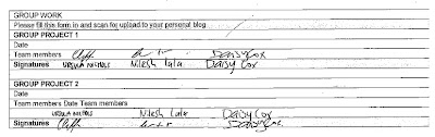
By Daisy Cox, Nilesh Lala, and Ursula Nichols
Tuesday, 29 May 2012
the clip: storyboard

I wanted to try and caption the movement of stop motion in my storyboard by using multiple copies of different images that I will use in my final clip. I think it communicates key aspects of my idea which will give me god guidelines for my project. My clip will be based on how different advertisements influence a person and looking at the implications of this.
Saturday, 26 May 2012
the clip: development
:

So, I guess this is what I have to achieve in my stop motion. I'm thinking of taking photos of someone walking through a city and interacting with various objects. However, the city and objects will all be animation so I will need to crop the person out of each shot and into a new frame. Going to be a loooooot of work haha.
Monday, 21 May 2012
Monday, 14 May 2012
the clip: inspire. ation.
Initial development for the clip. I'm looking at Culture+Context and exploring the ways that social issues affect design. So, as the title suggests, this is just the inspiration in it all. Cheeeeeeeck it out.
INITIAL BRAINSTORM/MINDMAP:

CULTURE+CONTEXT:
"enables students to... explore new concepts, evolving theories and historical ideas that contribute to design in contemporary culture. It recognises the increasing importance of design, and is influenced by new technologies, shifting geo-politics and global culture and society... Culture+Context is a cross-disciplinary subject providing an insightful approach to critical understandings and contemporary interpretations of design. Students will acquire thorough knowledge of key historical and theoretical approaches in design, and will examine their impact on visual culture."
COOL CLIPS:
I like the method used for this.
Cool clips. About it.
I like how this deals with an issue and is thought provoking.
Friday, 11 May 2012
blog four: curatorial
A Straight Curve
 |
| A Straight Curve - Ursula Nichols |
“Think simple... reduce the whole of its parts into the simplest terms, getting back to first principles.”
- Frank Lloyd Wright, 1987 (The Vancouver Sun, 2007)
A Straight Curve explores the idea that everything can be made from a straight line; that when an object is looked at in it’s most innocent form, it can be broken down into basic, geometric shapes.
The use of basic shapes and lines is seen repeatedly throughout design history from Neoclassical design to the Bauhaus and Minimalists; the idea that beauty is found in simplicity is the key element of this design.
A Straight Curve uses elements of design by Frank Lloyd Wright and Frank Gehry. In Wright’s design, geometric forms are used to create compelling forms that give unity and form to his work (Keane & Keane, 2005). This concept was carried into A Straight Curve - the piece showcases the way in which an irregular form is made merely by a series of straight lines with multiple pieces of wire. In this, A Straight Curve looks at how a curve can be created in an unconventional way. The curve which is created was influenced by Gehry’s innovative use of the curve as he devloped the curve into unconventional and contemporary ways (Forgey, 2001).
A Straight Curve juxtaposes the fluid curve with the bold horizontal line, made from black card, which cuts through the vertical lines which create the curve. A Straight Curve essentially conveys and emphasises the way in which a fluid form can be made entirely out of straight lines.
Reference List:
Reference List:
Duplexes built in an arts and craft style. (2007). The Vancouver Sun, pp. M.1-M1. http://search.proquest.com/docview/242027275?accountid=14782
Forgey, B. (2001, May 27). Architect frank gehry, ahead of the curves. The Washington Post, pp. G.01-G1. Retrieved from http://search.proquest.com/docview/409146489?accountid=14782
Keane, Mark & Keane, Linda. (2005). The Geometry of Frank Lloyd Wright, Nexus Network Journal, vol. 7 no. 1. Retrieved from http://nexusjournal.com/Keane.html
Thursday, 10 May 2012
group work 1: milk audio
Company Poster:
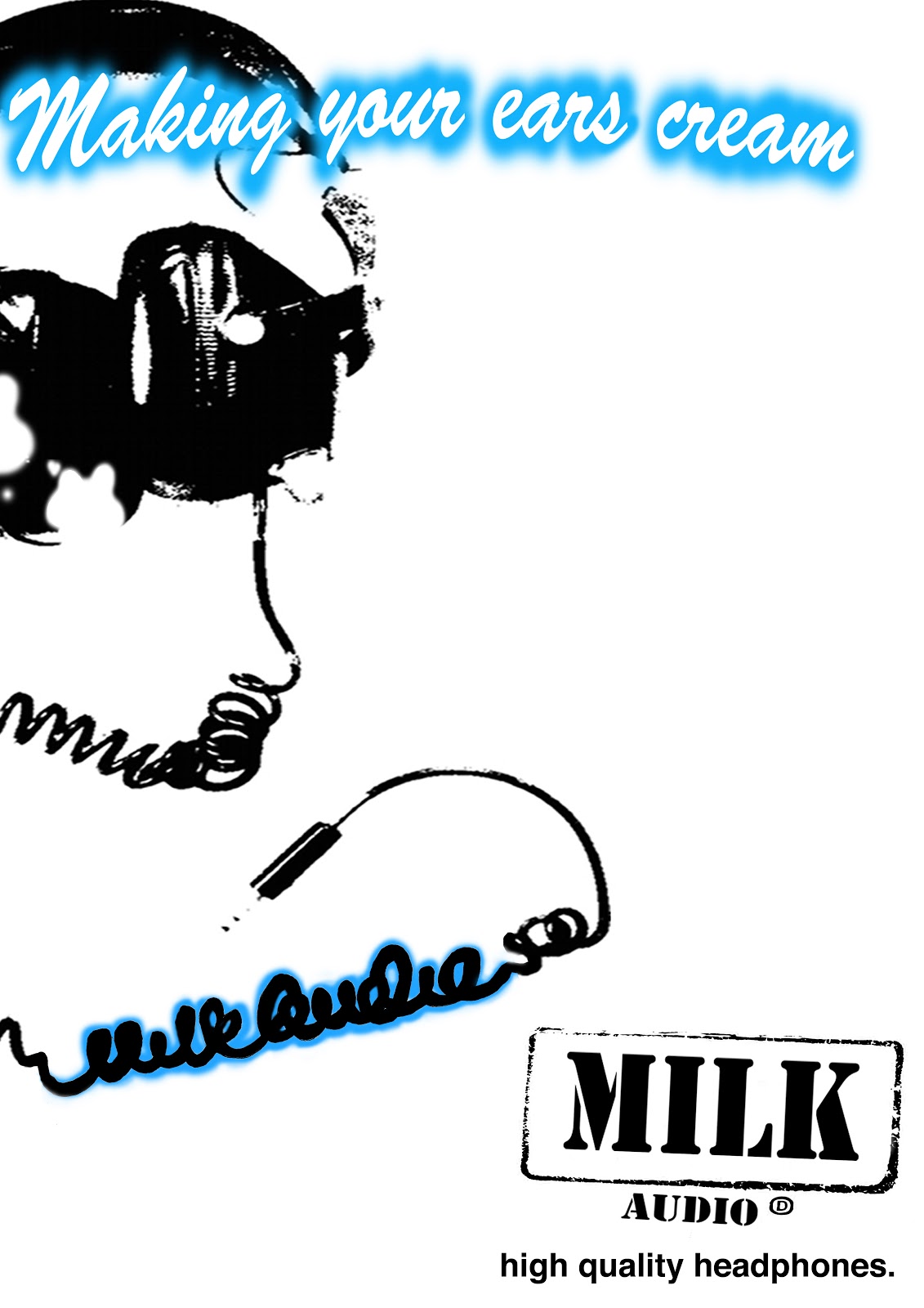
Milk Audio:
- Sound Production: Specialising in headphone design
- Demographic: Teenagers/young adults
By Daisy Cox, Nilesh Lala and Ursula Nichols.
Monday, 7 May 2012
one word film: mistake.
Sound Reference List:
Typing: http://www.freesfx.co.uk/sfx/KEYBOARD+TYPING
Breathing: http://www.freesound.org/people/bevangoldswain/sounds/54776/
Exhale: http://www.freesound.org/people/otherthings/sounds/65619/
Grunt: http://www.freesfx.co.uk/sfx/frustrated
Thursday, 3 May 2012
one word moooooovie development.
Animation Draft:
In my final version, I have added more variations of making mistakes in my animation. I also added more sounds, of breathing, a frustrated "grunt/moan" sound and a deep breath. I think this strengthened my ideas, making the meaning of the word more clear.
Developed Story Boards:
Consume:

Triumph:


Mistake 2:


Consume: Playing with the idea of being a consumer (buying things) and then eating. I like this idea as it expresses two meanings of one word.
Triumph: Showing the battle of climbing a mountain - a great triumph. In this animation, all letters will have different personalities. I am quite interested in giving characters different personalities.
Mistake: This looks into the idea of typing on a computer and the frustration of making errors while typing. I think that this idea would be effective as it is simple.

Disperse: Simple animation - the letters all spread out. I think this idea is a bit too simple, and don't think it really has much room to develop.
Wipe: Taking the idea of windscreen wipers. As the wipers move, the word is revealed then "wiped" away again. I quite like this idea, except I don't think it explains the most obvious meaning of the word.
Stack: The font is made to look like blocks that are stacked. As the stack is finished, it becomes wobbly and falls over. This idea looks a bit messy, and also not as clear meaning is conveyed.
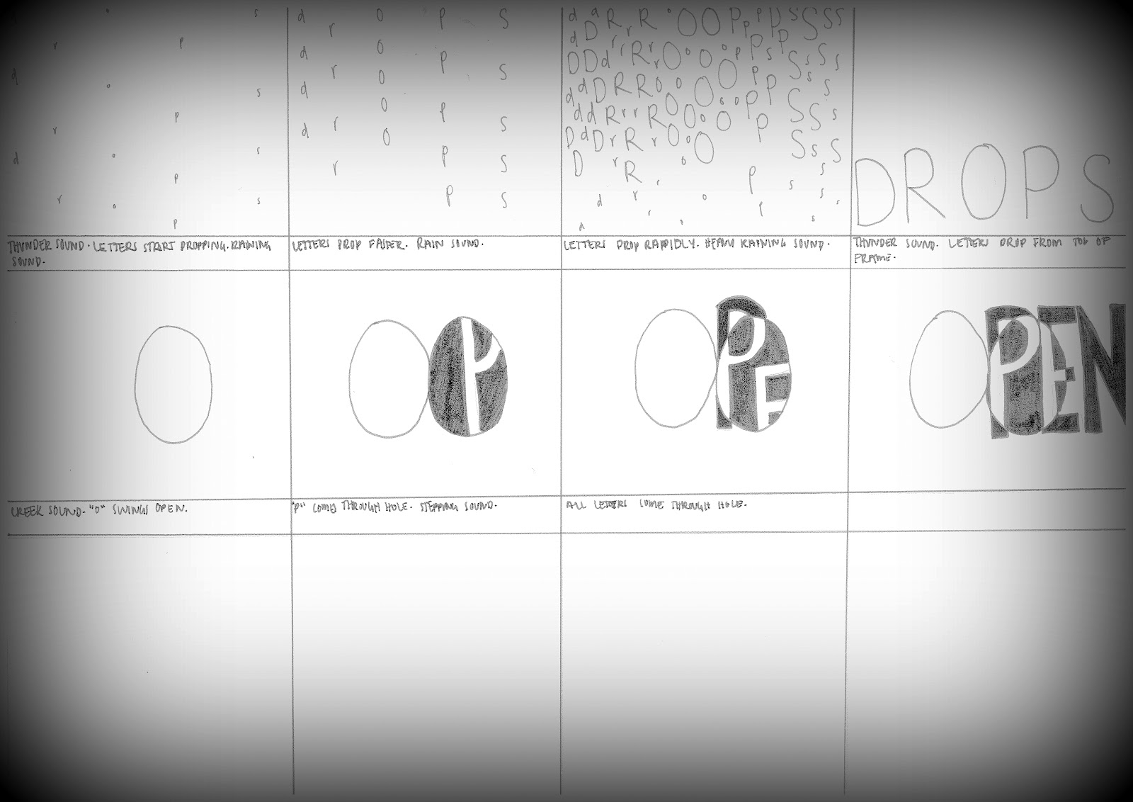
Open: The "O" acts as a door which opens, allowing the other letters to come through. I don't think this idea is as strong as my others.
Brainstorm:
My initial brainstorm, thinking of different words that I could use..

Subscribe to:
Comments (Atom)