Pages

Monday 15 October 2012

light : final images


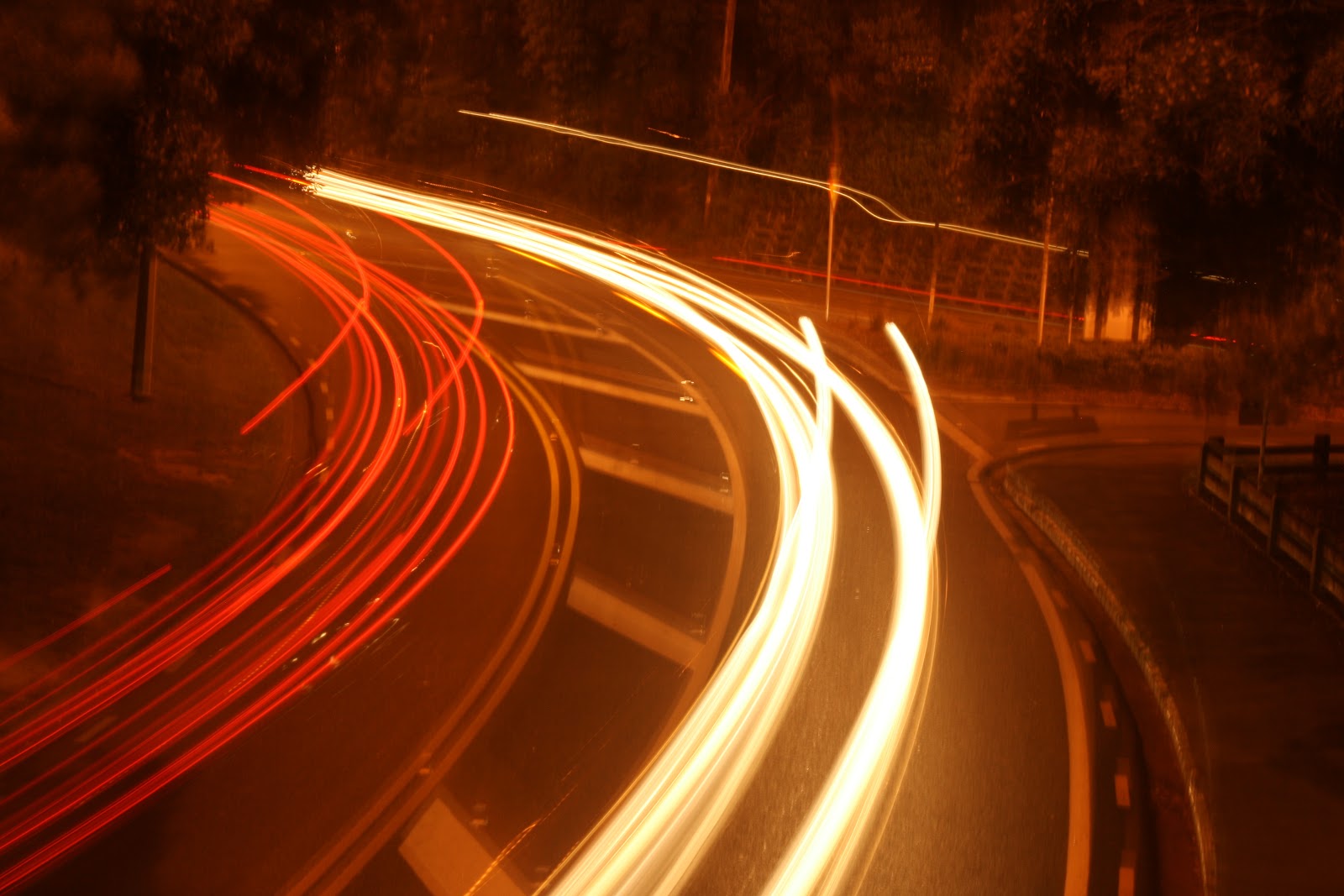
My final images are set up in a way which shows a decrease in energy through Wellington, ending with an overall outlook of the city to give a larger idea of the distribution. I believe they communicate my ideas of light acting as energy well.

 Although a couple of the images are a little bit blurry (images 3 and 5), I like the idea of it being blurry in the image 3 as it adds to the pace of the image, supported by the high concentration of the light trail. The blurriness occurred due to the raging winds which were too much of a match for me and my tripod. Ideally, I would reshoot these photographs but weather conditions limited this. I believe they were essential to my final set to show progressiveness which is why they remain.

Overall, from this project I have explored different types of light and how it can be used to communicate energy, and how a long exposure on the camera can be used todo this. I am sufficiently happy with my final outcome. Enjoy.

Saturday 13 October 2012

light : second shoot

So, another tricky night to take photos but it had to be done. The wind was so bad, it pretty much blew me and my tripod away.. I got a few photos out of it though, i'll see what I can do with them. Here are a few of my more successful ones..

 This image was taken in the middle of Courtenay Place. I like it purely because of the way the dense beam of light is coming forward.


 Taken on the motor way, these two images have really nice clean light trails which look effective.

 I decided to take images from Mt. Vic, to give an idea of how the light or energy is distributed around the city.  This image is more reflective of Leon Gurevitch's images such as "New York Energy Tourists" and "Peak Panorama" (found here , slides 82 and 86). Although Gurevitch's images perhaps showcase the light trails better, I still think my image is effective as you can clearly see more illuminated areas due to more light or energy. I think this will flow well in my final images in order to give audiences an overall perspective of my shoot.


 I like this image as it is really focused on the light trails and there are no other lights in the image to distract from them.
 This image was taken to show difference in traffic density or energy. It was taken at the round a bout in Cobham Drive, Kilbirnie. It is also the busiest street in the Eastern suburbs, and think this is a good contrast to the images taken from in the city as it shows the difference in "busy" in respective places.

I like the trails in this image, especially the fact that you can see how the car has switched lanes. However, I feel that all the other lights in the image distract too much from the trails.

Overall, I am feeling ok about my photographs, I think that I can clearly communicate my idea of difference of energy in different parts of the city with them.

Monday 8 October 2012

light : failed shoot

It has been impossible to take my images this past week. I was holding out for the weekend as I needed my friend to drive me around to the spots to take the images - the army barracks, Duncan Terrace, Mount Vic, and Kaiwhara - however, the weather has been shit, and the trusty Wellington wind proves to be, well, trusty. It was too much of a mission trying to take the photo's in this environment as a) getting a still image for a long exposure photograph was pretty much impossible, and b) even if I could get a steady image, I couldn't see anything because of the fog and/or hail. So, pretty much, I'm screwed if the weather doesn't clear up. Yeah, that's about it.

Wednesday 3 October 2012

light : precedents

image from here

 image from here

 image from here

These three images show the aesthetic I want to achieve in my project. I think the trails are really interesting, showing where people are going and how many are going there.

 image from here

I like this image as it is a bit of a different look on light trails. 

Tuesday 2 October 2012

light : task two


Here is my attempt at an HDR image, it was interesting playing around with the different settings to get different looks. I tended to gravitate towards this sort of out come, which I think creates a crisp, fresh look that also however looks a bit surreal.

Sunday 30 September 2012

light: final proposal

I have redeveloped my proposal, and am now heading in a more clear direction for this project


For this project, I aim to explore how cars can communicate the density of  light or "energy" in areas around Wellington. I will take images of busy roads around Wellington, using a long exposure, in order to capture traffic passing by. These cars will produce light trails, and areas where there are more traffic will produce stronger and more prominent ones. By having these images together as a set, it will be interesting to compare the different streets and see how "busy" is only relative to the area the image is in, in that a busy street in the suburbs, isn't all that busy compared to a street in town. From this, "energy maps" will be created of Wellington where we can see where the high amount of energy.

In this project I am essentially exploring how light acts as a communicator for energy. Although this is a concept already tested, I think it will be interesting to explore Wellington in this way.

Wednesday 26 September 2012

light : task one


For this I tried writing with light - it didn't turn out too well. But it still looks cool and would definitely be keen to explore the idea a bit more within my project. I think it would be cool maybe overlapping this kind of stuff with my other images.

Tuesday 25 September 2012

light : initial shoot

These are the first photographs I took. I like the diversity I achieved in the photographs as I was testing the shutter speed, depth of field, and movements. 


These are my favorite photographs out of this shoot and think I will further investigate the same techniques applied in these images.

Although this image was shot (accidentally) in black and white, I like the shortness of the light lines  and the movement they have as it still shows the landscape line. For this photograph I used a longer shutter speed, which didn't allow me to have as much movement present in my later photos. I also like that with the absence of colour, it is a bit harder to tell what they actually are. 

 I like this shot as it is very abstract - you can't really tell that it's a landscape - it could be cars passing by. I also like the different lines created, some are bold and full while others appear to be broken. However, i'm not sure that this reflects my proposal well. This photograph was using a very short shutter speed with a quick horizontal movement. However, I still think it is a successful photograph.


These three images I think embodies my proposal a bit better - you can clearly see the outline of the landscape which is what I wanted to show. Each photo progresses with shutter speed and movement. I like the progression that was created. I really like the second one as it is a bit more abstract than the others.
For this image, I used a short depth of field which gave a more hazy effect to the images. With this, it meant that the shutter speed was longer and it captured smaller movements. I like the sort of smokiness that appears in this image and how it rises from the lights - it sort of reminds me of a birthday cake. I also like how you can see the line of the landscape in it.

light : proposal

For this project I want to explore "light drawings" of Wellington night time landscapes to see how I can show how the lights create the shape of the city. While doing this, I will play with different shutter speeds and depth of field.

By using the different shutter speeds, I will be able to control how the light travels, and the different lengths will able me to either create short, sharp movements or long and random movements. This will give me different aesthetics as to how I can present the photographs. The different depth of field will allow me to explore how blurring the lights or making them sharp effects the outline of the landscapes. Both these controls will slow me to get a range of looks in my photographs.

In this project, I essentially want to show Wellington in a more abstract way, allowing viewers to see it in a way they wouldn't usually.

Saturday 15 September 2012

time : final photographs

These images are meant to be viewed as sets. Enjoy.


"What We Eat"

Ultimately, I am happy with my series. I think it achieves the things which I wanted it to do. I think the images work really well together, with all the "before" pictures being laid out neatly, and all the "after" pictures taking a circular form - this ties the images together nicely. However, I think that the series could be enhanced if I had used better lighting in my initial shoots. In this, I still think I managed to portray the vibrant and commercial feel of my precedents successfully. I think this series shows time in a cool way, displaying how significantly things can change over time. Overall, I am reasonably happy with my final results.

Saturday 8 September 2012

time : task 2


Before

After

For this task I explored the differences of before and after shots of house hold tasks, such as the dishes, vacuuming and the washing. This set came out the best as I believe it shows how something unordered becomes ordered. I think the random way the clothes are ing in the before picture and the multiple shadows given creates chaos to the picture. However, in the after picture, the straight and clean lines of the clothes horse are exposed and the neatly folded clothes give a sense of uniform. Overall, I am quite happy with my results.

Thursday 6 September 2012

time : precedents


         ARTISTIC EXPERIMENTATION

Martin Parr captures society in a way which captures the commercial nature of of world. The vibrant tones ted in his work give this distorted view of society and seem to enhance very aspect of it. To me, his images remind me of advertisements and this is an aspect I want to explore in my series.


Parr's style is one I would like to imitate and develop for this project. His images to me feel almost sarcastic and that they are mocking society, and I think this idea sort of fits with what I'm showing. In the images of the banana cake below, I see it as almost a practical joke, that you're eating those yuck bananas without even knowing. However, I need to use photoshop to achieve the tones Parr uses in his images.


Wednesday 5 September 2012

time : third shoot

These images are of the four meals that I chose to photograph. I couldn't quite achieve the lighting I needed so I will have to look into correcting this in photoshop. However I think that images turned out nicely and have the commercial feel I was looking for.


time : development


I like these images for two main reasons - I like how we can see the change of state of the ingredients - especially the spaghetti which goes from a straight rigid product to this free flowing product. 


This is interesting to me as I feel like people can hide so many different things in soup. Although this is a fairly simple recipe, i think the idea is still behind it from the huge chunk of pumpkin which is just completely morphed into a runny substance.


 These images are a bit of a different look, where any nutritional benefit of the meal, seemingly disappears and is engulfed by the burger bun.  


I love these photographs as it shows how we use these disgusting old bananas and chuck it together with some other stuff, and we will happily eat the yuck bananas. i think this really portrays how things can be changed and transformed through a process in time.