This project was really interesting and really made me appreciate how film photography allows you to develop a relationship with your images. However, in this I am not entirely happy with how my final images turned out.
Some of the techniques I used to re-introduce elements of the initial photographs didn’t work as well as others and didn’t make such interesting images. Also I believe my physical object could have been designed better to recreate the feeling of selecting images to view which is a part of instagram. I am not really sure if I communicated the idea of technology degrading photography through my project. I think I could have achieved this by managing my time better to be able to really have a clear direction of how I was going to do this.
In the end, although my project does not quite successfully portray my idea, I feel that I myself have a better appreciation for film photography after working with the images for so long. I also think some of my images are quite interesting to look at.
Tuesday, 8 October 2013
Monday, 7 October 2013


Friday, 4 October 2013
lomographics : second remediation
After reshooting my negatives and running them through photoshop to get the positive images, I reshot the images through the computer screen in order to get the pixilated look that you get from shooting through a screen. I feel like this step was important to my project as it ties the images back to technology.


Thursday, 3 October 2013
lomographics : remediation
For my remediation, I wanted to take an element of the photograph and apply it to the negative in a way which replicated its presence in the original image. I feel like some of them turned out better than others, but these were my favourites.

Rubbing the negative on pavement - image was from the crocodile bikes where we rode on pavement. I think this one is the least successful of the ones that worked out alright. I like how the action is pretty direct from the image but the markings it made aren't very good looking. I think it would have been better if I could have actually attached the negative to the wheel of the bike and see how it scratched it that way.


With these images I placed ice-cream over them and let it melt a bit. This relates well to the original photograph as the ice-cream actually was melting and going everywhere. I love the fluid look of the melting ice-cream, it looks like the work created by Chadwick which I am pretty pleased about. I found the marks which the ice cream left on the negative pretty interesting too, especially which bits remained unaffected because this bit was in ice-cream too (seen in the first image)


For these images I submerged the negative under water to replicate the girls having their feet underwater too. This didn't really do too much to the negative afterwards however.


This is probably my favourite remediation of the series because I did use colour in it. I placed water over this image as we were standing looking at the waterfront and unlike the other water image, we were over it not in it. In this, my niece also commented on how the water was "so blue" so I used colouring to portray this. The way that the colouring moved through the water on the negative was beautiful and again made motions like Chadwick achieved. I also like the way that it dyed the negative in a way that almost resembles ripples in water.
Overall, I am reaosnably happy with my remediations. Although they didn't all go how I had planned, I feel as though I have a few really strong images and am interested as to how they turn out once they are inverted.
Monday, 30 September 2013
lomographics : artist precedents
I have had a bit of trouble finding precedents for this project but I cam across work from Mark Sink's Diana Does Famous Faces series and was really intrigued. Although I don't think it relates to my project very much, I really enjoyed his series. I did get the feeling that his photo's were a lot like digital images in the way which they were shot; they looked heaps just like normal snapshots off someones phone at a party one night. I think the fact that this isn't the case and that although it seems like the image wasn't really thought about, Sink actually had to spend a lot of time with the film to actually develop the image and see what he had taken. In this, his series actually relates quite well to the concept of my project.
For this series Sink used a Diana camera, making the images blurry.
I love how this image looks like it could be on instagram today and how unposed and natural this image looks. I also love the movement in the background as it makes it look ore real.
For this series Sink used a Diana camera, making the images blurry.
 |
| From Diana Does Famous Faces, 1990 |
Saturday, 28 September 2013
lomographics : artist precedents
I've been looking at a lot of abstract work for inspiration for my remediation of film and I came across Mark Chadwick. He was inspired by the way in which technology has become such a large part of society and in this, gave creative expression to machines in order to paint these pictures. He explores the concept of removing the artist from the painting by choosing materials and colour on chance and then attaching these objects to the machines and leaving the room. He uses a variety of tools and mediums to produce these works.
In much of Chadwick's work, I find it amazing how machines and tools create such fluid and natural movements. It gives a really nice contrast to the mechanical devices that create the images. I also love how a viewer can interpret it in so many different ways. This image in particular was created with acrylic paint on canvas.
 |
| Fluid Painting 81, 2013 |
Although I am not going to use the same process as Chadwick, I think his concept of technology taking over our society has a really strong connection to my project and how digital photography has impacted film photography. I really love the abstract fluidity of this image and hope that I can too create something with this aesthetic as I think it shows a lot of movement and life which is what I am trying to show that by using film, these things are more apparent in images.
lomographics : shoot
Finally got my film developed and I'm pretty stoked that I got all of the images! They're not the bets pictures or anything but I'm just happy none of them are completely unable to be used. There are these weird black lines in them though and I have no idea what they're from but I don't mind at all. I'm quite excited to get to the remediation of them now!
It was interesting when I was with my niece, seeing what she took photos of. Heaps of the time I was thinking why are you taking a picture of that but I just had to remember that she was using a phone and not expensive film! However, when I was taking them I actually did feel a bit like I was using a phone too, just because how with the Holga you can't see what you've taken so I almost didn't really care how it turned out. I think that aspect of it really relates to what my project's concept is about; losing relationship with film. It's a bit different now that the film has been processed. The images are so cliche that it's quite funny. The film really gives them quite a nostalgic feeling.
Friday, 27 September 2013
lomographics : final proposal
For this project, I aimed to explore how photography has developed due to advancements in technology, especially in smartphones. These devices have allowed us to take hundreds of images quickly and at no cost, making the process of taking an image easy for almost anyone to do. In this, I feel that the art of photography has been degraded and the relationship that someone has with an image is gone because the same amount of thought and time does not go into an image anymore due to the ease of digital photography. For this project I want to explore this concept, looking at how instagram has changed how people take a view photos today.
For this project, I will follow my niece for an afternoon around Wellington City. It will be her first visit here. Whenever she uses her iPhone to take a picture, I will also with my Holga lomo camera. From here, I will get the images developed, and with the negatives produced, I will take an element from the photograph and photograph the negative again with this element. By doing this, I want to communicate that film offers more to a photograph by bringing an element of the photograph out of the image, making it involve the taker and viewer more. I will then run these images back through photoshop and then take digital images of them on my computer screen, bringing the images back to the digital world of instagram.
Through this process I hope to communicate the idea of a film photograph having a relationship with the photographer and viewer as opposed to the smartphone images. I also want to recreate the feel of viewing images on a smartphone app such as instagram, specifically looking at the selecting process it has.
Thursday, 26 September 2013
lomographics : artist precedents
Erin Antognoli's is an sculptor and photographer. In her series Holga Cityscape's, she takes images of mundane city scenes and layers them together to create a much more interesting image. She achieves this by not rolling the film fully each time so each image is overlapped with another to merge the two frames. She shot this series with black and white film and processes them with a selenium tone which also adds to the blandness of the initial images, making it even more of a task to make the images interesting to look at. This technique offers multiple perspectives and new ways of looking at a scene and even creates new cityscapes together.
I find all of the images in this series of Antognoli's interesting, however I really like this one in particular as it offers two different view points of the street view. Again, as single images, these are very boring and plain, but put together they really make me think about where I actually am on the street and how I should be viewing it. It almost creates a 3D experience. I also really enjoy the natural edges on the images, maybe created by not fully submerging the film into the processing chemicals, I find they create a really whimsical and natural border, contrasting the very hard subject matter.
Although this technique does not really relate to my project, I am really interested in trying to recreate images the way she has. I think she really effectively took something boring and made it interesting. I think this relates to my project as I feel that the images taken with smartphones and specifically for instagram are really banal snapshots of everyday life. By remediating these images and bringing some life back to them I think I will too be able to make the everyday look interesting again through film, much like Antognoli has.
 |
| 7th Street Bike, 2006 |
Although this technique does not really relate to my project, I am really interested in trying to recreate images the way she has. I think she really effectively took something boring and made it interesting. I think this relates to my project as I feel that the images taken with smartphones and specifically for instagram are really banal snapshots of everyday life. By remediating these images and bringing some life back to them I think I will too be able to make the everyday look interesting again through film, much like Antognoli has.
Wednesday, 25 September 2013
lomographics : proposal
For this project I want to explore the idea of how technology has changed the way we take pictures. In this, I will specifically investigate how smartphones have allowed people to take thousands of pictures instantly, consequently Taking some of the value of photographs away.
I will do this by taking token pictures of Wellington City - ones that people take all the time and post up on their Facebook and Instagram. However, these photos will be taken with a Olga camera and film to sort of juxtapose the idea of "snap happy" images of nothing that are quick and free from a smartphone versus the long process of manual photography which requires a photographer to think about the images and then have the images developed which is a lot longer process and a relationship with the camera and images are created. After I have developed my images I will then take them through various processes in order to manually tweak and filter them which is done easily on Photoshop or phones.
I think it will be interesting to see which images actually look better and more interesting between the manual ones and the smartphone ones.
Tuesday, 17 September 2013
photography as data : evaluation
I am very happy with how The Genetic Patchwork turned out. The series clearly investigates genetic similarities and differences within a family and also communicates how they view these features compared to those of their family member's.
I think my project developed quite well from my first shoot to my last both technically and creatively. By using feedback from my tutor and peers and incorporating a different artist's technique, my project gained more depth and better fulfilled the concept of photography as data. It also allowed for my project to be more original. I am also happy with my physical hand in which was a flip book made up of the different family member's ratings, which when viewed together, gives a representation of how each family member sees themselves in each family member, exposing the portions that they think look most like themselves, creating a complete face of their viewed most similar facial features. I think the book complimented the project nicely.
This project could have been improved if I had been able to include the father in the series. This would complete the family and enable for the series to be a true investigation of how genetics work within a family. While I was happy with the final images, they still could have been even sharper if I had actually shot them at a studio or all at the same time, just to get complete consistency over the whole shoot.
Overall, I believe The Genetic Patchwork successfully communicates and investigates the themes I was working with in this project.


Friday, 13 September 2013
photography as data : development
While using the ratings to compose my images, I found that the section method I used created a graph-like aesthetic which I was quite interested in. The elements it used such as the grid and blocks made the whole image look very scientific. I decided to embrace this look and block out the different sections of the comparing face to clearly show the different ratings and to embrace and emphasise the graph that was created. Here are a couple of examples:


The face on the right hand is the "constant" while the face on the right was placed based on what ratings the constant gave each portion. While the graph blocks being in colour makes them more distinguishable, I prefer the grey tones as it isn't too distracting and also looks a lot cleaner and doesn't detract from the scientific aesthetic. I think for my final edits I will add a bit more information to the graphs in order to make them a bit more understandable. I also think I will play around with using these images with the non-graphical ones so that it is still easy to compare the genetic similarities and differences.
Wednesday, 11 September 2013
photography as data : third shoot
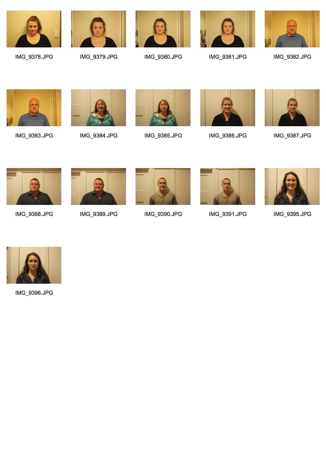
This morning I took photos of the family members before they headed off to work and school so I could catch them in daylight, in order to correct the yellow tone that I have had in the previous shoots. This worked much better and gave true representation of skin and hair tone. However, I was unable to capture the whole family as the father went away a couple of days ago so I will have to leave him out f the series.
I have also added a new dimension to the project after talking to Matt my second shoot. Instead of randomly selecting portions of the family member's faces to compare with another's, I have divided the face into five different sections and then asked each member to rate these sections on a scale of 1 - 4 based on the likeness of other family member's sections. This idea was pulled from Nancy Burson's Warhead image, as she made the new face by proportionally representing different figures. By asking each family member to give me these ratings, my final images will not only show genetic similarities and differences, but also explore how each family member views their genetic similarities with other family members.
The face was divided into five portions, the forehead, eyes, nose, mouth and chin. These are the results of the ratings:
Alana (mother): Miriam (oldest sister): Benjamin (brother): Rachael (youngest sister):
M: f:2 e:0 n:1 m:2 c:2 A: f:3 e:2 n:2 m:3 c:1 M: f:3 e:1 n:1 m:2 c:2 M: f:1 e:2 n:3 m:2 c:1
B: f:1 e:1 n:1 m:2 c:3 B: f:1 e:2 n:1 m:3 c:2 A: f:1 e:2 n:3 m:2 c:2 B: f:3 e:1 n:2 m:2 c:3
R: f:1 e:1 n:3 m:2 c:2 R: f:1 e:3 n:4 m:2 c:2 R: f:1 e:2 n:1 m:2 c:1 A: f:2 e:1 n:2 m:2 c:1
I will then divide the face into four columns, and base how much of each family member is placed over another face based on these results.
These are the images I took for this shoot. Because I still took the images at different times (based on how early/late they got up) there were still a couple of differences in lighting. However, they can be easily fixed.


Tuesday, 10 September 2013
photgraphy as data: final proposal
For this project, I aim to explore how genetics determine facial features across a family and how we view these different characteristics. This will be achieved by taking studio style portraits then patching the various faces together through photoshop.
This project will be focused on one family; a mother, a father, two sisters and a brother. They will be asked to rate their own 5 facial features (forehead, eyes, nose, mouth, jaw) versus the other members on a scale of 1 to 4. Based on these ratings, their faces will be merged together to create a representation of their own perspective of genetics while showcasing similarities and differences between the family members.
As mentioned, studio style portraits will be taken of each family member in order to fuse the faces together easily by making sure lighting is constant. This will make the series appear more seamless and also give a scientific aesthetic as it will be quite clean and sterile. I will then use photoshop to apply portions of the other family member's faces based on their ratings. This will be achieved through a grid used over all the images in order to get true representations of their ratings which will be constant throughout the series. I think the grid will also add to the scientific aesthetic of the series also.
I think that this project will be an interesting display of how genetics differ between family members while also investigating how people see themselves in their family members.
photography as data - second shoot
For my second shoot, I photographed a different family in order to have more participants to compare. In this shoot, I tried to get better lighting and used a blank background so it would be easier to merge the images together. However, the lighting quality is still very poor, and their are again shadows that distract from the images.
When merging this shoot, I was more influenced by Nancy Burson in the way which she chose different features from various people to make new images. From this, I took portions of a family member and placed them over another member's portrait to create a sort of patchwork aesthetic. I quite like how it turned out, giving a bit more of an abstract look while still being able to compare genetic similarities and differences. Although it is not as scientific or obvious as Collettes technique, it removes any chance of badly joining the images together in photoshop, making the series look more professional .
 |
| Son/Mother |
 |
| Sister/Sister |
 |
| Brother/Sister/Mother |
Sunday, 8 September 2013
photography as data : photograhic precedent
I have just looked at Nancy Burson's photograph Warhead I. Burson was one of the leaders in using technology with photography. For this image, Burson blended images of several world leaders faces together in order to create a completely different person. The faces used were each represented by the percentage of nuclear weapons that nation had. In this aspect, Burson's technique uses photography as data to show this statistic.
The fact that the image looks quite mundane, just like another portrait, but actually represents quite serious data adds a lot of depth to the image. I think I could add this sort of data capturing to my images in order to add another layer of information to the series as opposed to just straight comparing the images.
The fact that the image looks quite mundane, just like another portrait, but actually represents quite serious data adds a lot of depth to the image. I think I could add this sort of data capturing to my images in order to add another layer of information to the series as opposed to just straight comparing the images.
 |
| Nancy Burson, Warhead I, 1982 |
Tuesday, 13 August 2013
photography as data : first images
For my first shoot I took portraits of three family groups, my stepdad and his daughter, my friend and her father and my brother, mother and myself. The images didn't turn out too well as they were taken at night with just normal room lighting and no controlled lighting. This gave the photo's a bad white balance and undesirable shadows. However, as a first shoot, they were enough for me to play around with to try and get an understanding of techniques that Ulric Collette used in his Genetic Portraits series.
These are the most successful images from my first shoot. They are of me and my brother. I feel like they worked the best out of my families shots as there were similarities between the facial structures which meant they were quite easy to match up. These images could definitely be improved by using a studio for consistent lighting and by also making sure the camera is parallel to the face for each shot, which I found was a big factor in the other images not being successful to match.
I first merged the photos together using photoshop and just adjusting the opacity of the layered image a few times. Although this technique didn't apply the same technique as Collette, I still feel that it shows the genetic similarities quite well. At each stage, the facial differences aren't too obvious, but when you jump from the first to last images they do appear quite drastic.


Overall, I think as a first shoot it went okay..ish. It definitely showed the factors that I have to carefully control in order to pull off Collete's technique. The images definitely show genetic similarities between family members, which is what I want to explore.
Contact Sheet:

These are the most successful images from my first shoot. They are of me and my brother. I feel like they worked the best out of my families shots as there were similarities between the facial structures which meant they were quite easy to match up. These images could definitely be improved by using a studio for consistent lighting and by also making sure the camera is parallel to the face for each shot, which I found was a big factor in the other images not being successful to match.
I first merged the photos together using photoshop and just adjusting the opacity of the layered image a few times. Although this technique didn't apply the same technique as Collette, I still feel that it shows the genetic similarities quite well. At each stage, the facial differences aren't too obvious, but when you jump from the first to last images they do appear quite drastic.
I then mimicked Collette's technique and did a straight half and half comparison. I think it turned out reasonably well in terms of showing genetic similarities. However, the problems mentioned earlier really bring the image down and distracting from what the image is trying to communicate. I also think that my photoshop technique to merge to put the images together really needs to be sharpened in order to pull off this technique as it is really visible to see where the images are joint.

 |
| Daughter/Father using Collette's half and half technique |
Contact Sheet:
photography as data : photographic precedents
My first precedent is Ulric Collette's Genetic Portraits series. His series started in 2008 when he was experimenting with an image of his son and himself for a different project. He had taken a portrait of his son and pieced it together with a portrait of himself. He seamlessly joined the pictures together using photoshop and found it interesting how his son resembled him so much. From here, the series grew and Collette has been photographing families through to now.
I found these two images especially interesting as the daughter strongly resembles both her mother and father in both images. To me, this suggests that it is easier to find similarities in genetics rather than the differences.
Collette's images are so successful because of how he has so perfectly executed each image; the faces match up seamlessly which allows for viewers to not be distracted by the fact that it is two faces, enabling comparison between the features to be done easily. Collette achieved this by using a studio to control each image's lighting to ensure it was the same for each shot. He then meticulously joined the photo's together paying close attention to details such as hair lines, hair colour and finding where the faces joined up best.
This technique will be useful for my project as it is an exact example of what I proposed to do. It uses photography as data to record information on family genetic similarities and differences, exploring how they change between family members.
Here is the complete series of Ulric Collette's Genetic Portraits
 |
| Daughter/Father |
 |
| Mother/Daughter Ulric Collette, Genetic Portraits, 200-2012 |
Collette's images are so successful because of how he has so perfectly executed each image; the faces match up seamlessly which allows for viewers to not be distracted by the fact that it is two faces, enabling comparison between the features to be done easily. Collette achieved this by using a studio to control each image's lighting to ensure it was the same for each shot. He then meticulously joined the photo's together paying close attention to details such as hair lines, hair colour and finding where the faces joined up best.
This technique will be useful for my project as it is an exact example of what I proposed to do. It uses photography as data to record information on family genetic similarities and differences, exploring how they change between family members.
Here is the complete series of Ulric Collette's Genetic Portraits
Sunday, 11 August 2013
photography as data : initial proposal
For this project, I am interested in looking at genetics within families, comparing facial features with other family members. In this, photography will be used to document how genetics play a part in an individuals make up, while comparing that makeup to other family members to see how genetic strings can be similar or different.
I will do this by photographing various family members. I will then photoshop their images together, putting two families members faces together. This will allow for us to compare the facial structures, seeing where they are alike or not.
This is based on Ulric Collette's Genetic Portraits series where he too combines family members faces. However, I want to develop this concept further into the idea of photography as data. I am unsure as to how exactly to do this. I think I will play with documenting traits in the side of the photos, or maybe categorising similar features together in separate images.
Tuesday, 6 August 2013
photographic fiction : evaluation
“Disposable Me” turned out alright, but it is not exactly what I had initially envisioned. I feel like I have only sort of portrayed the coffee cup’s feelings or created empathy towards it. However I think that the series blends well together and tells a narrative well.
For this project I found it easy to think of ways in which I could personify the disposable coffee cup, however in practice it turned out a bit more difficult. After basing the series of Spike Jonze’s ad “Lamp”, I can see how important audio is to establish the mood of the video. I also found it difficult to manipulate the colours of the image to give cooler tones and feelings to them as when I did this it looked obviously changed and not natural. Another challenge I faced was capturing the whole lifecycle of the cup- I had proposed to start the series from the very start of the journey, at the manufacturers or suppliers, but once I got there to shoot, the company showed me their staff coffee cups and then let me know that they didn’t have any of their sale stock “in at the moment”. I had to rework the project, starting the series from inside a cafe instead.
From this project I learnt how photographs can be used to create a story and manipulate how people feel. It gave me a greater appreciation for photography and understanding of how film was created from it.
If I could have done anything differently for this project it would to have been more organised so that when I went to the suppliers I could have found another one to explore instead of having to change my project.


Subscribe to:
Comments (Atom)